Nulla id nibh ligula. Etiam finibus elit nec nisl faucibus, vel auctor tortor iaculis. Vivamus aliquet ipsum purus, vel auctor felis interdum at. Praesent quis fringilla justo. Ut non dui at mi laoreet gravida vitae eu elit. Aliquam in elit eget purus scelerisque efficitur vel ac sem. Etiam ante magna, vehicula et vulputate in, aliquam sit amet metus. Donec mauris eros, aliquet in nibh quis, semper suscipit nunc. Phasellus ornare nibh vitae dapibus tempor.
Aliquam purus enim, fringilla vel nunc imperdiet, consequat ultricies massa. Praesent sed turpis sollicitudin, dignissim justo vel, fringilla mi.
Vivamus libero leo, tincidunt eget lectus rhoncus, finibus interdum neque. Curabitur aliquet dolor purus, id molestie purus elementum vitae. Sed quis aliquet eros. Morbi condimentum ornare nibh, et tincidunt ante interdum facilisis. Praesent sagittis tortor et felis finibus vestibulum. Interdum et malesuada fames ac ante ipsum primis in faucibus. Vivamus dapibus turpis sit amet turpis tincidunt, sit amet mollis turpis suscipit. Proin arcu diam, pretium nec tempus eu, feugiat non ex.
Nulla id nibh ligula. Etiam finibus elit nec nisl faucibus, vel auctor tortor iaculis. Vivamus aliquet ipsum purus, vel auctor felis interdum at. Praesent quis fringilla justo. Ut non dui at mi laoreet gravida vitae eu elit. Aliquam in elit eget purus scelerisque efficitur vel ac sem. Etiam ante magna, vehicula et vulputate in, aliquam sit amet metus. Donec mauris eros, aliquet in nibh quis, semper suscipit nunc. Phasellus ornare nibh vitae dapibus tempor.
Donec feugiat tincidunt eros, ac aliquam purus egestas condimentum. Curabitur imperdiet at leo pellentesque mattis. Fusce a dignissim est. In enim nisi, hendrerit placerat nunc quis, porttitor lobortis neque. Donec nec nulla arcu. Proin felis augue, volutpat ac nunc a, semper egestas dolor. Sed varius magna non lacus viverra, at dapibus sem interdum. Proin urna nibh, maximus nec interdum ut, hendrerit et arcu. Nunc venenatis eget nulla at tempor. Duis sed tellus placerat, bibendum felis quis, efficitur nisi. Morbi porta placerat urna et pharetra. Proin condimentum, libero ac feugiat efficitur, est orci consectetur sapien, a pretium leo leo in elit. Quisque fringilla finibus arcu, pretium posuere urna posuere sit amet. Nullam quis sapien a augue aliquet accumsan eget eu risus. Ut at mi sed velit condimentum porta. Proin vestibulum congue ullamcorper.
Nunc blandit ligula mi, quis commodo dolor fermentum sit amet. Nam vehicula pharetra lacus a vulputate. Duis pulvinar vestibulum dolor, vel commodo arcu laoreet ac. Vestibulum sed consequat purus, vitae auctor metus. Duis ut aliquet odio, at tincidunt nunc. Vestibulum dignissim aliquet orci, rutrum malesuada ipsum facilisis vel. Morbi tempor dignissim nisi. Maecenas scelerisque maximus justo eget sodales. Sed finibus consectetur vulputate. Pellentesque id pellentesque nulla. Sed ut viverra eros. Vestibulum ut ligula quam.
]]>Nulla id nibh ligula. Etiam finibus elit nec nisl faucibus, vel auctor tortor iaculis. Vivamus aliquet ipsum purus, vel auctor felis interdum at. Praesent quis fringilla justo. Ut non dui at mi laoreet gravida vitae eu elit. Aliquam in elit eget purus scelerisque efficitur vel ac sem. Etiam ante magna, vehicula et vulputate in, aliquam sit amet metus. Donec mauris eros, aliquet in nibh quis, semper suscipit nunc. Phasellus ornare nibh vitae dapibus tempor.
Aliquam purus enim, fringilla vel nunc imperdiet, consequat ultricies massa. Praesent sed turpis sollicitudin, dignissim justo vel, fringilla mi.
Vivamus libero leo, tincidunt eget lectus rhoncus, finibus interdum neque. Curabitur aliquet dolor purus, id molestie purus elementum vitae. Sed quis aliquet eros. Morbi condimentum ornare nibh, et tincidunt ante interdum facilisis. Praesent sagittis tortor et felis finibus vestibulum. Interdum et malesuada fames ac ante ipsum primis in faucibus. Vivamus dapibus turpis sit amet turpis tincidunt, sit amet mollis turpis suscipit. Proin arcu diam, pretium nec tempus eu, feugiat non ex.
Nulla id nibh ligula. Etiam finibus elit nec nisl faucibus, vel auctor tortor iaculis. Vivamus aliquet ipsum purus, vel auctor felis interdum at. Praesent quis fringilla justo. Ut non dui at mi laoreet gravida vitae eu elit. Aliquam in elit eget purus scelerisque efficitur vel ac sem. Etiam ante magna, vehicula et vulputate in, aliquam sit amet metus. Donec mauris eros, aliquet in nibh quis, semper suscipit nunc. Phasellus ornare nibh vitae dapibus tempor.
Donec feugiat tincidunt eros, ac aliquam purus egestas condimentum. Curabitur imperdiet at leo pellentesque mattis. Fusce a dignissim est. In enim nisi, hendrerit placerat nunc quis, porttitor lobortis neque. Donec nec nulla arcu. Proin felis augue, volutpat ac nunc a, semper egestas dolor. Sed varius magna non lacus viverra, at dapibus sem interdum. Proin urna nibh, maximus nec interdum ut, hendrerit et arcu. Nunc venenatis eget nulla at tempor. Duis sed tellus placerat, bibendum felis quis, efficitur nisi. Morbi porta placerat urna et pharetra. Proin condimentum, libero ac feugiat efficitur, est orci consectetur sapien, a pretium leo leo in elit. Quisque fringilla finibus arcu, pretium posuere urna posuere sit amet. Nullam quis sapien a augue aliquet accumsan eget eu risus. Ut at mi sed velit condimentum porta. Proin vestibulum congue ullamcorper.
Nunc blandit ligula mi, quis commodo dolor fermentum sit amet. Nam vehicula pharetra lacus a vulputate. Duis pulvinar vestibulum dolor, vel commodo arcu laoreet ac. Vestibulum sed consequat purus, vitae auctor metus. Duis ut aliquet odio, at tincidunt nunc. Vestibulum dignissim aliquet orci, rutrum malesuada ipsum facilisis vel. Morbi tempor dignissim nisi. Maecenas scelerisque maximus justo eget sodales. Sed finibus consectetur vulputate. Pellentesque id pellentesque nulla. Sed ut viverra eros. Vestibulum ut ligula quam.
]]>Optimization for various types of devices and resolutions plays a fundamental role in modern website design. Web page layouts should be genuinely responsive and not rely on any fixed-size elements. Web designers using fluid grids and flexible images will guarantee that a web page will render well on a variety of devices, windows, and screen sizes.
The greatest gifts you can give your children are the roots of responsibility and the wings of independence.
Denis Waitley
Most users search for something interesting (or useful) and clickable; as soon as some promising candidates are found, users click. If the new page doesn’t meet users’ expectations, the back button is clicked and the search process is continued.
Strategies for Personal Growth and Development
Not all websites are made equal. Some websites are simple, logical, and easy to use. Others are a messy hodgepodge of pages and links.
Without website navigation, your visitors can’t figure out how to find your blog, your email signup page, your product listings, pricing, contact information, or help docs.
Quick and easy access to the content they’re after is more important for your website users than a… visually-stunning design.
Website navigation allows visitors to flow from one page to another without frustration. If you’ve done your job well, visitors leave your site with the intention to return and might even buy something from you or sign up for your email list.
Bad navigation is an especially common problem. We’ve all struggled to find things on disorganized websites without any logical structure. It feels hopeless.
Using “complex large pictures”. Because a carousel generally carries a lot of picture messages, complex large pictures result in low performance and “slow loading rate” of the sites, especially those whose first homepages are occupied by high-resolution carousels.
Unleashing Your Full Potential
In design, rhythm is created by simply repeating elements in predictable patterns. This repetition is a natural thing that occurs everywhere in our world. As people, we are driven everyday by predictable, timed events.
One of the best ways to use repetition and rhythm in web design is in the site’s navigation menu. A consistent, easy-to-follow pattern—in color, layout, etc. Gives users an intuitive roadmap to everything you want to share on your site.
Rhythm also factors into the layout of content. For example, you “might have” blog articles, press releases, and events each follow their own certain layout pattern.
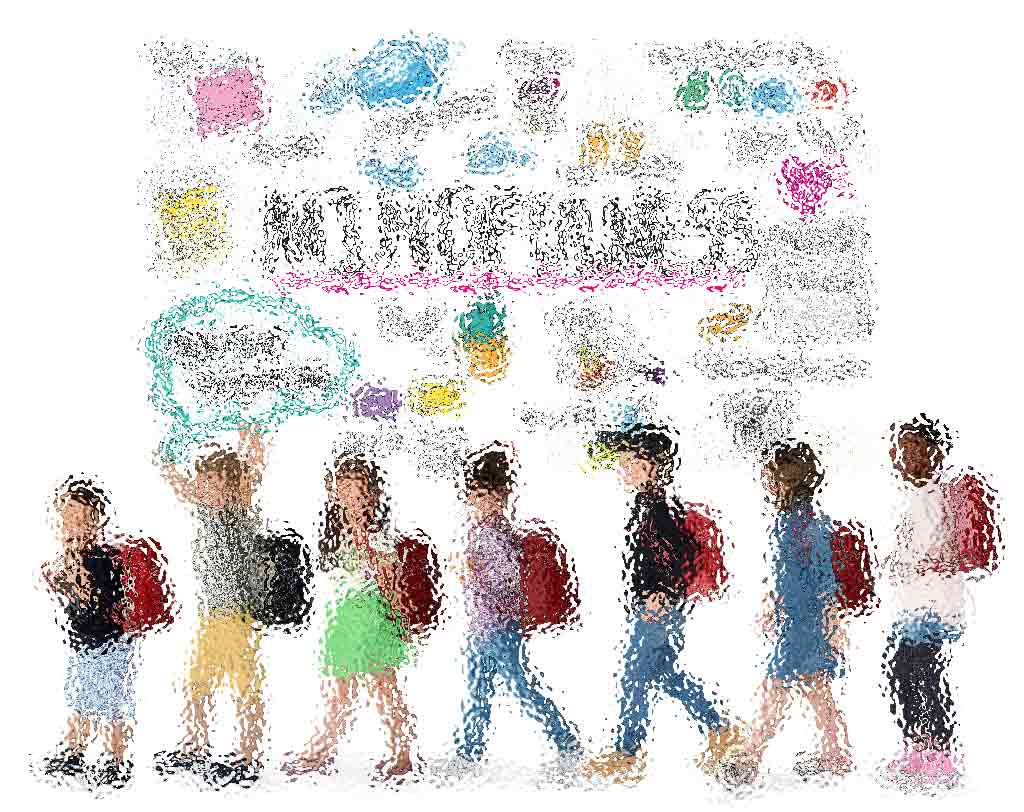
Balancing Academics and Physical Well-Being in Children
Nobody enjoys looking at an ugly web page. Garish colors, cluttered images and distracting animation can all turn customers “off” and send them shopping “somewhere else”. Basic composition rules to create more effective:
- Direct the Eye With Leading Lines
- Balance Out Your Elements
- Use Elements That Complement Each Other
- Be clear about your “focal points” and where you place them
The size and position of elements in a composition will determine its balance. An unbalanced design generates tension, which may be the goal in many design projects, but for web apps that demand repeated comfortable use, tension is not a desirable trait.
A Comprehensive Approach to Movement Education
UX and UI: Two terms that are often used interchangeably, but actually mean very different things. So what exactly is the difference?
Education is the passport to the future, for tomorrow belongs to those who prepare for it today.
Malcolm X
UX design refers to the term “user experience design”, while UI stands for “user interface design”. Both elements are crucial to a product and work closely together. But despite their relationship, the roles themselves are quite different.
Promoting Physical Education for Children
Good design guides the user by communicating purpose and priority. For that reason, every part of the design should be based on an “informed decision” rather than an arbitrary result of personal taste or the current trend.
Provide distinct styles for interactive elements, such as links and buttons, to make them easy to identify. For example, “change the appearance of links” on mouse hover, “keyboard focus”, and “touch-screen activation”.
Engaging Activities for Physical Development
Design is not the end-all solution to all of the worlds problems — but with the right thinking and application, it can definitely be a good beginning to start tackling them.
]]>As far as the laws of mathematics refer to reality, they are not certain; and as far as they are certain, they do not refer to reality.
Albert Einstein
Most users search for something interesting (or useful) and clickable; as soon as some promising candidates are found, users click. If the new page doesn’t meet users’ expectations, the back button is clicked and the search process is continued.
Quantum science and technology
Not all websites are made equal. Some websites are simple, logical, and easy to use. Others are a messy hodgepodge of pages and links.
Without website navigation, your visitors can’t figure out how to find your blog, your email signup page, your product listings, pricing, contact information, or help docs.

Quick and easy access to the content they’re after is more important for your website users than a… visually-stunning design.
Bad navigation is an especially common problem. We’ve all struggled to find things on disorganized websites without any logical structure. It feels hopeless.
How do scientists conduct quantum experiments?
In design, rhythm is created by simply repeating elements in predictable patterns. This repetition is a natural thing that occurs everywhere in our world. As people, we are driven everyday by predictable, timed events.
Rhythm also factors into the layout of content. For example, you “might have” blog articles, press releases, and events each follow their own certain layout pattern.
What is entanglement and why is it important?
Nobody enjoys looking at an ugly web page. Garish colors, cluttered images and distracting animation can all turn customers “off” and send them shopping “somewhere else”. Basic composition rules to create more effective:
- Direct the Eye With Leading Lines
- Balance Out Your Elements
- Use Elements That Complement Each Other
- Be clear about your “focal points” and where you place them
The size and position of elements in a composition will determine its balance. An unbalanced design generates tension, which may be the goal in many design projects, but for web apps that demand repeated comfortable use, tension is not a desirable trait.
How are quantum phenomena used in technology today?
UX and UI: Two terms that are often used interchangeably, but actually mean very different things. So what exactly is the difference?
Quantum physics thus reveals a basic oneness of the universe.
Erwin Schrodinger
UX design refers to the term “user experience design”, while UI stands for “user interface design”. Both elements are crucial to a product and work closely together. But despite their relationship, the roles themselves are quite different.
What is quantum physics?
Good design guides the user by communicating purpose and priority. For that reason, every part of the design should be based on an “informed decision” rather than an arbitrary result of personal taste or the current trend.

Provide distinct styles for interactive elements, such as links and buttons, to make them easy to identify. For example, “change the appearance of links” on mouse hover, “keyboard focus”, and “touch-screen activation”.
Breaking down the barriers
Design is not the end-all solution to all of the worlds problems — but with the right thinking and application, it can definitely be a good beginning to start tackling them.
]]>Optimization for various types of devices and resolutions plays a fundamental role in modern website design. Web page layouts should be genuinely responsive and not rely on any fixed-size elements. Web designers using fluid grids and flexible images will guarantee that a web page will render well on a variety of devices, windows, and screen sizes.
The greatest gifts you can give your children are the roots of responsibility and the wings of independence.
Denis Waitley
Most users search for something interesting (or useful) and clickable; as soon as some promising candidates are found, users click. If the new page doesn’t meet users’ expectations, the back button is clicked and the search process is continued.
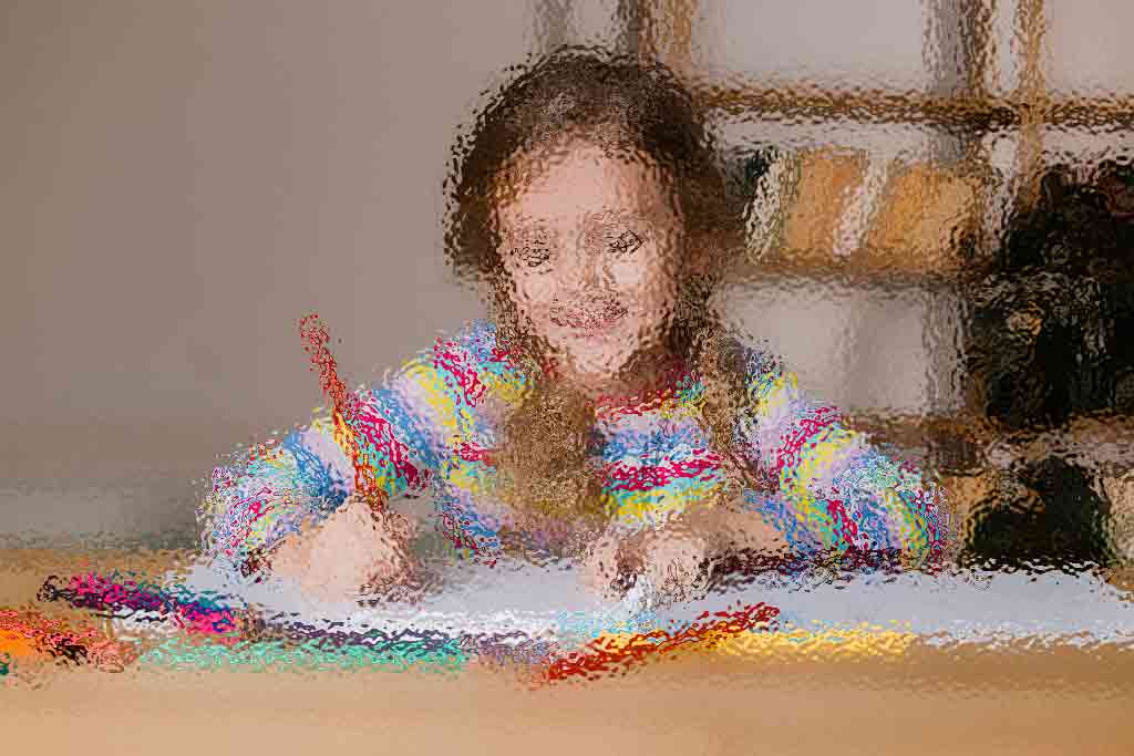
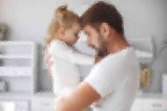
Strategies for Personal Growth and Development
Not all websites are made equal. Some websites are simple, logical, and easy to use. Others are a messy hodgepodge of pages and links.
Without website navigation, your visitors can’t figure out how to find your blog, your email signup page, your product listings, pricing, contact information, or help docs.

Quick and easy access to the content they’re after is more important for your website users than a… visually-stunning design.
Website navigation allows visitors to flow from one page to another without frustration. If you’ve done your job well, visitors leave your site with the intention to return and might even buy something from you or sign up for your email list.
Bad navigation is an especially common problem. We’ve all struggled to find things on disorganized websites without any logical structure. It feels hopeless.
Using “complex large pictures”. Because a carousel generally carries a lot of picture messages, complex large pictures result in low performance and “slow loading rate” of the sites, especially those whose first homepages are occupied by high-resolution carousels.
Unleashing Your Full Potential
In design, rhythm is created by simply repeating elements in predictable patterns. This repetition is a natural thing that occurs everywhere in our world. As people, we are driven everyday by predictable, timed events.
One of the best ways to use repetition and rhythm in web design is in the site’s navigation menu. A consistent, easy-to-follow pattern—in color, layout, etc. Gives users an intuitive roadmap to everything you want to share on your site.
Rhythm also factors into the layout of content. For example, you “might have” blog articles, press releases, and events each follow their own certain layout pattern.
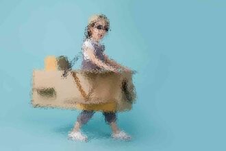
Balancing Academics and Physical Well-Being in Children
Nobody enjoys looking at an ugly web page. Garish colors, cluttered images and distracting animation can all turn customers “off” and send them shopping “somewhere else”. Basic composition rules to create more effective:
- Direct the Eye With Leading Lines
- Balance Out Your Elements
- Use Elements That Complement Each Other
- Be clear about your “focal points” and where you place them
The size and position of elements in a composition will determine its balance. An unbalanced design generates tension, which may be the goal in many design projects, but for web apps that demand repeated comfortable use, tension is not a desirable trait.
A Comprehensive Approach to Movement Education
UX and UI: Two terms that are often used interchangeably, but actually mean very different things. So what exactly is the difference?
Education is the passport to the future, for tomorrow belongs to those who prepare for it today.
Malcolm X
UX design refers to the term “user experience design”, while UI stands for “user interface design”. Both elements are crucial to a product and work closely together. But despite their relationship, the roles themselves are quite different.
Promoting Physical Education for Children
Good design guides the user by communicating purpose and priority. For that reason, every part of the design should be based on an “informed decision” rather than an arbitrary result of personal taste or the current trend.
Provide distinct styles for interactive elements, such as links and buttons, to make them easy to identify. For example, “change the appearance of links” on mouse hover, “keyboard focus”, and “touch-screen activation”.
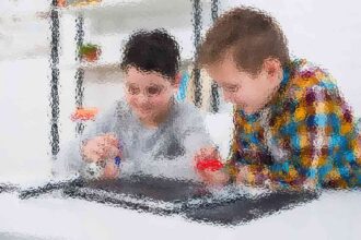
Engaging Activities for Physical Development
Design is not the end-all solution to all of the worlds problems — but with the right thinking and application, it can definitely be a good beginning to start tackling them.
]]>As far as the laws of mathematics refer to reality, they are not certain; and as far as they are certain, they do not refer to reality.
Albert Einstein
Most users search for something interesting (or useful) and clickable; as soon as some promising candidates are found, users click. If the new page doesn’t meet users’ expectations, the back button is clicked and the search process is continued.
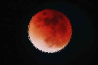
Quantum science and technology
Not all websites are made equal. Some websites are simple, logical, and easy to use. Others are a messy hodgepodge of pages and links.
Without website navigation, your visitors can’t figure out how to find your blog, your email signup page, your product listings, pricing, contact information, or help docs.
More Read

Quick and easy access to the content they’re after is more important for your website users than a… visually-stunning design.
Bad navigation is an especially common problem. We’ve all struggled to find things on disorganized websites without any logical structure. It feels hopeless.
How do scientists conduct quantum experiments?
In design, rhythm is created by simply repeating elements in predictable patterns. This repetition is a natural thing that occurs everywhere in our world. As people, we are driven everyday by predictable, timed events.
Rhythm also factors into the layout of content. For example, you “might have” blog articles, press releases, and events each follow their own certain layout pattern.
What is entanglement and why is it important?
Nobody enjoys looking at an ugly web page. Garish colors, cluttered images and distracting animation can all turn customers “off” and send them shopping “somewhere else”. Basic composition rules to create more effective:
- Direct the Eye With Leading Lines
- Balance Out Your Elements
- Use Elements That Complement Each Other
- Be clear about your “focal points” and where you place them
The size and position of elements in a composition will determine its balance. An unbalanced design generates tension, which may be the goal in many design projects, but for web apps that demand repeated comfortable use, tension is not a desirable trait.
How are quantum phenomena used in technology today?
UX and UI: Two terms that are often used interchangeably, but actually mean very different things. So what exactly is the difference?
Quantum physics thus reveals a basic oneness of the universe.
Erwin Schrodinger
UX design refers to the term “user experience design”, while UI stands for “user interface design”. Both elements are crucial to a product and work closely together. But despite their relationship, the roles themselves are quite different.
What is quantum physics?
Good design guides the user by communicating purpose and priority. For that reason, every part of the design should be based on an “informed decision” rather than an arbitrary result of personal taste or the current trend.
Provide distinct styles for interactive elements, such as links and buttons, to make them easy to identify. For example, “change the appearance of links” on mouse hover, “keyboard focus”, and “touch-screen activation”.
Breaking down the barriers
Design is not the end-all solution to all of the worlds problems — but with the right thinking and application, it can definitely be a good beginning to start tackling them.
]]>Optimization for various types of devices and resolutions plays a fundamental role in modern website design. Web page layouts should be genuinely responsive and not rely on any fixed-size elements. Web designers using fluid grids and flexible images will guarantee that a web page will render well on a variety of devices, windows, and screen sizes.
The greatest gifts you can give your children are the roots of responsibility and the wings of independence.
Denis Waitley
Most users search for something interesting (or useful) and clickable; as soon as some promising candidates are found, users click. If the new page doesn’t meet users’ expectations, the back button is clicked and the search process is continued.
Strategies for Personal Growth and Development
Not all websites are made equal. Some websites are simple, logical, and easy to use. Others are a messy hodgepodge of pages and links.
Without website navigation, your visitors can’t figure out how to find your blog, your email signup page, your product listings, pricing, contact information, or help docs.
Quick and easy access to the content they’re after is more important for your website users than a… visually-stunning design.
Website navigation allows visitors to flow from one page to another without frustration. If you’ve done your job well, visitors leave your site with the intention to return and might even buy something from you or sign up for your email list.
Bad navigation is an especially common problem. We’ve all struggled to find things on disorganized websites without any logical structure. It feels hopeless.
Using “complex large pictures”. Because a carousel generally carries a lot of picture messages, complex large pictures result in low performance and “slow loading rate” of the sites, especially those whose first homepages are occupied by high-resolution carousels.
Unleashing Your Full Potential
In design, rhythm is created by simply repeating elements in predictable patterns. This repetition is a natural thing that occurs everywhere in our world. As people, we are driven everyday by predictable, timed events.
One of the best ways to use repetition and rhythm in web design is in the site’s navigation menu. A consistent, easy-to-follow pattern—in color, layout, etc. Gives users an intuitive roadmap to everything you want to share on your site.
Rhythm also factors into the layout of content. For example, you “might have” blog articles, press releases, and events each follow their own certain layout pattern.
Balancing Academics and Physical Well-Being in Children
Nobody enjoys looking at an ugly web page. Garish colors, cluttered images and distracting animation can all turn customers “off” and send them shopping “somewhere else”. Basic composition rules to create more effective:
- Direct the Eye With Leading Lines
- Balance Out Your Elements
- Use Elements That Complement Each Other
- Be clear about your “focal points” and where you place them
The size and position of elements in a composition will determine its balance. An unbalanced design generates tension, which may be the goal in many design projects, but for web apps that demand repeated comfortable use, tension is not a desirable trait.
A Comprehensive Approach to Movement Education
UX and UI: Two terms that are often used interchangeably, but actually mean very different things. So what exactly is the difference?
Education is the passport to the future, for tomorrow belongs to those who prepare for it today.
Malcolm X
UX design refers to the term “user experience design”, while UI stands for “user interface design”. Both elements are crucial to a product and work closely together. But despite their relationship, the roles themselves are quite different.
Promoting Physical Education for Children
Good design guides the user by communicating purpose and priority. For that reason, every part of the design should be based on an “informed decision” rather than an arbitrary result of personal taste or the current trend.
Provide distinct styles for interactive elements, such as links and buttons, to make them easy to identify. For example, “change the appearance of links” on mouse hover, “keyboard focus”, and “touch-screen activation”.
Engaging Activities for Physical Development
Design is not the end-all solution to all of the worlds problems — but with the right thinking and application, it can definitely be a good beginning to start tackling them.
]]>As far as the laws of mathematics refer to reality, they are not certain; and as far as they are certain, they do not refer to reality.
Albert Einstein
Most users search for something interesting (or useful) and clickable; as soon as some promising candidates are found, users click. If the new page doesn’t meet users’ expectations, the back button is clicked and the search process is continued.
Quantum science and technology
Not all websites are made equal. Some websites are simple, logical, and easy to use. Others are a messy hodgepodge of pages and links.
Without website navigation, your visitors can’t figure out how to find your blog, your email signup page, your product listings, pricing, contact information, or help docs.

Quick and easy access to the content they’re after is more important for your website users than a… visually-stunning design.
Bad navigation is an especially common problem. We’ve all struggled to find things on disorganized websites without any logical structure. It feels hopeless.
How do scientists conduct quantum experiments?
In design, rhythm is created by simply repeating elements in predictable patterns. This repetition is a natural thing that occurs everywhere in our world. As people, we are driven everyday by predictable, timed events.
Rhythm also factors into the layout of content. For example, you “might have” blog articles, press releases, and events each follow their own certain layout pattern.
What is entanglement and why is it important?
Nobody enjoys looking at an ugly web page. Garish colors, cluttered images and distracting animation can all turn customers “off” and send them shopping “somewhere else”. Basic composition rules to create more effective:
- Direct the Eye With Leading Lines
- Balance Out Your Elements
- Use Elements That Complement Each Other
- Be clear about your “focal points” and where you place them
The size and position of elements in a composition will determine its balance. An unbalanced design generates tension, which may be the goal in many design projects, but for web apps that demand repeated comfortable use, tension is not a desirable trait.
How are quantum phenomena used in technology today?
UX and UI: Two terms that are often used interchangeably, but actually mean very different things. So what exactly is the difference?
Quantum physics thus reveals a basic oneness of the universe.
Erwin Schrodinger
UX design refers to the term “user experience design”, while UI stands for “user interface design”. Both elements are crucial to a product and work closely together. But despite their relationship, the roles themselves are quite different.
What is quantum physics?
Good design guides the user by communicating purpose and priority. For that reason, every part of the design should be based on an “informed decision” rather than an arbitrary result of personal taste or the current trend.
Provide distinct styles for interactive elements, such as links and buttons, to make them easy to identify. For example, “change the appearance of links” on mouse hover, “keyboard focus”, and “touch-screen activation”.
Breaking down the barriers
Design is not the end-all solution to all of the worlds problems — but with the right thinking and application, it can definitely be a good beginning to start tackling them.
]]>