Over the last eighteen months, the big buzz in web design has emerged that is mobile web development. After the rise (and continually rising) and powerful smartphones ranging from different sources such as Apple and Android, and now that over 10 percent of all web traffic comes from Android and other mobile devices, it is just as imperative to make your website compatible to these handy and portable platforms. Below are some options you can use to make your WordPress website mobile friendly.
Install Plug-ins
The first and most basic option that many web designers use to make their site mobile compatible are plug-ins. Two of the many popular plug-ins today are WPTouch and Onswipe
Source: Onswipe.com
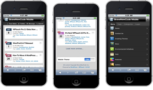
Source: wordpress.org/plugins/wptouch/screenshots/
Onswipe essentially turns your website into web app, complete with features such as a homescreen icon, accelerometer aware content, and social media capabilities. WPTouch, on the other hand, is great for those needing a simple solution for mobile users. It takes your website and automatically renders a web based version of your site for mobile users.
In both cases, all you need to do is install the plug-in to make your site mobile ready. Although it may seem easy, but all of you should watch out because it does have some drawbacks, such as when experiencing these issues: first, your site is automatically being rendered, and for some sites, this could cause your content to become difficult to use or even omit certain important content. Next, you cannot customize the content very much and certainly cannot customize your user experience based on device.
Using Subdomains and Sytlesheets
Although a bit more time consuming, another option for maximizing your content for mobile users is to create a subdomain of your main site. These sites were already a popular option for web developers, are subdomains are still used by larger websites as a way to customize the mobile web experience of visitors. These domains usually have an extension of either m. or .mobi and serve as completely separate sites. Realize that you must keep content updated on both sites and it is probably a good idea to have a link back to the parent site should the user require it.
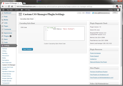
Source: wordpress.org/plugins/custom-css-manager-plugin/screenshots/
Another popular option for some developers is the use of stylesheets. With stylesheets, you can customize the user experience for each type of mobile device. While this is a lot of extra work for the developer, it is great for those that like to present different content to different devices. Usually, a big chunk of mobile devices are Android smartphones and Apple products, so before updating your website according to all available mobile compatibility tasks, make sure you do your own research first and determine which mobile devices are more used to view your site.
Responsive Web Design
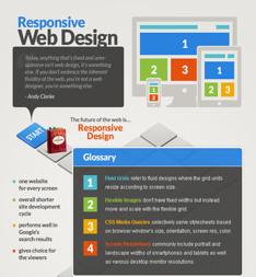
Considered the best option by many web developers, and one that has gained a lot of popularity in the last year or so, is a responsive web design. A responsive web design essentially takes your content and automatically rearranged and resizes it, based on the screen of the device that your site is displayed on. You can check out this great video on how to build a mobile/android friendly WordPress site, including how a responsive templates work in WordPress.
Source: Templates.com
The big advantages to this form of design include cross-platform compatibility and Google acceptance. Google prefers responsive design and many web developers have switched to this style based on Google alone. Keep in mind however that a responsive web design is a bit more technical than most and unless you use a pre-defined responsive template for your site, you will likely want to hire a web developer to incorporate this style.


