Even with the rise of social media, email marketing is still a popular marketing tool. Emails have the power to drive sales, be easily shared with new customers, and make a regular connection with past customers in a meaningful way. Plus, email templates make creating new emails a piece of a cake. Easy and effective – a brilliant marketing combination. Here are 10 best practices for designing an email template:
Think Thin – Emails are opened in a wide range of browsers and screen sizes, from massive work monitors to tiny handheld tablet devices. Showcase a solid background as a frame around the thinner actual email design and content. Numbers to aim for include 550 pixel wide background and 480 pixel wide actual email content. No matter what – keep the width under 650 pixels.
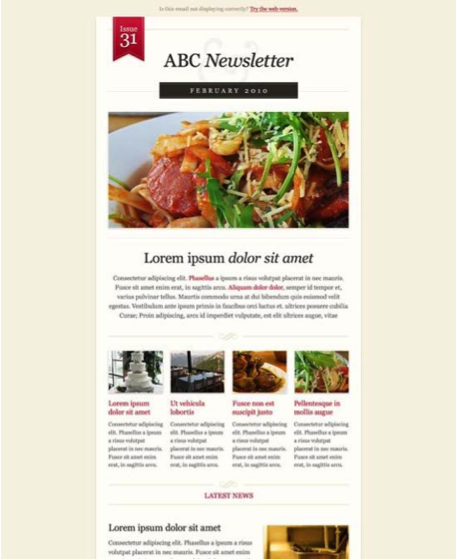
Go Metro – Pinterest, Windows 8, and many other websites and software programs are now featuring the tiled metro look, similar to apps on a smartphone. While you don’t want to go overboard with a 5×5 series of tiles, take a note from the metro UI and use design to create tables which showcase different pieces of information. This will help titles, pull quotes, products, and more standout while keeping the overall style clean.
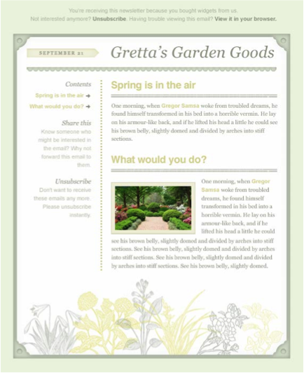
Add Depth – Beveled corners or a simple shadow background on the frame part of the email will help the actual email content pop from the page and feel more tangible to the viewer.
Give them Options – Make sure your client can easily customize their email template by changing the color and size of fonts, select from a handful of different layout options, and more. By giving your email template customers options, they will be able to change the look and feel of their emails along with the seasons and more.
Take Notice of Links – Don’t design links to seamlessly blend with the text around them. Let links jump out from the page (tastefully). The point of a marketing email is to get readers to click through to a website – links are the roads to get there, so make them easy to find.
Keep it Simple – Email is most popularly checked first thing in the morning when people arrive at work. Email readers are just getting started with their day, and most likely will click on a marketing email in an attempt to put off the impending doom of starting their work day. Don’t let the design overwhelm them and make them feel like memos and staff meetings are more appealing. Instead, design email templates to incorporate plenty of white space and showcase a few simple images and text boxes for your clients to fill with new content for each email.
Remember Mobile – Be sure your email is designed to scale and convert for mobile devices. The latest studies show almost half of adult Americans have a smartphone – make sure all of them can appreciate your email.
Simple on Software – Don’t get too fancy with your programming. Design email templates in a popular software program, avoid CSS shorthand and internal classes or IDS. Try to stay away from video embeds and in general keep your code clean, tight, and easy to read by people besides just you.
The Must-Haves – A couple things all marketing emails need, whether template or not: An unsubscribe link, a plain-text viewing option, and absolute paths with no attachments.

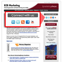
Be Social – Don’t forget to include a simple way for your clients to promote their social media outlets through your email design template. It is the age of social media and email linked back to Facebook, Twitter, and more is perfect for cross-marketing efforts.
If you wish to write for us, please contact us here


