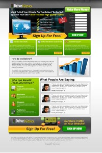
Landing pages are essential for just about every online business. Whether you’re trying to build an email list, selling a product or service or inform people about something you NEED a landing page. Some people use it to capture leads others to sell something. By having a landing page you’re being very clear to your users about what you want them to do. And the data you get to keep is very powerful. Landing pages may occasionally have a second page, to finish the action. A good example is a checkout page, or a “shipping” page.
The nice thing about landing pages is that more and more people are using them and they’re becoming widely recognized as an essential part of doing business. Sure, websites are great. However websites can also be very confusing to the user, having them click in circles instead of doing what you want them to.
Lets not confuse a landing page with a website. A website is generally multiple pages and  contains the links to other pages of the site such as “home, about us, services, contact” etc. A landing page generally doesn’t have that sort of thing – you want to put all of the important information on just 1 page; no links to other pages on your site where the user can get confused.
You want your landing page to have trust symbols as well as whatever social proof you have available. As I mentioned there are many types of pages. At Hyper6 we are constantly designing killer landing pages. I’m going to list a few of the most popular ones here and talk about them.
A Sales/Offer Landing Page:
Let’s pretend its for a diet product that helps people lose weight. These pages have become pretty much standard when selling supplements or that sort of thing online. You’ve probably seen these pages all over the web. From acai berry to African mango, every merchant has at least a few versions of a landing page. These pages generally offer some sort of incentivize to get people to fill out their information on the landing page and then once you enter that, you will be taken to a checkout page.
On the landing page itself, you’ll generally see a similar layout as this is what works best. A nice header with some check-marks explaining the benefits of the product, a form on the right side, and a big splash image of whatever it might be you’re trying to promote. If you’re doing a weight loss page, you’ll most likely have a sexy looking inshape woman who has a nice flat stomach and looks hot. If you’re doing a skincare page, you would have a pretty lady with very nice skin. You get the idea.
The rest of the page is used to explain the product. Generally how it works, benefits, testimonials, news/media, any research or results, and the ingredients. These are usually divided up into seperate sections with a nice headline for each, and lots of images and text about whats being talked about.
Email Submit Landing Pages:
These pages are generally very simple, with simply and image, a headline and maybe a quick blub below that about what they’re receiving. If the person has to jump through any hoops to receive their “free” product then you should either have a link to the terms & conditions or have the terms on the page itself. Lets say you’re interested in building a database of people who are interested in receiving something for “FREE”. Wether its an iPad, iPhone, or something of less value the concept can generally remain the same. What you want to do is give people as few fields as possible to fill out on that first page. Generally, just an email field is great as this allows you to build a database of prospects, and if they leave on page 2 when they’re prompted for their shipping information you still have their email address to market to them later. On the second page you’ll request shipping and contact information such as: First Name, Last Name, Phone, Address, City, State/Province, Postal code/Zip code.
Leadgen Landing Pages
Leadgen pages work great and are becoming increasingly popular especially amongst professionals such as Dentists, Doctors, Teachers, Coaches and a long list of others. Lets say you’re a dentist, and you want to get more clients. Instead of running a PPC campaign and just sending people to your website, you send them to a landing page where you’re gathering their information for the purposes of selling them later on. These pages are generally not very big, maybe about 1 screen in length and are very straight to the point. They will also help your website stand out.
You have some checkmarks outlining some of the benefits, again with a form on the right. I would suggest keeping the fields to the bare minimum, maybe 4-5 fields such as: Name, Phone, Email, Zip code. With this information you can find out what area of town they live in and you can call them or email them to pitch why they need your service. You may be offering a special such as a $49 CLEANING to gain customers. It’s always a good idea to put an insentive on the page as this will generate the most leads. The average buyer likes to feel like they’re getting a good deal, even if they’re looking at getting their teeth cleaned.

