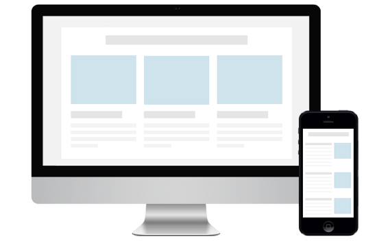
Responsive newsletter layout for emails is more complex using Tables. Even after the adoption of responsive templates for websites and blogs, email templates remained untouched for quite a long time due to the complexity and designer haven’t bothered about it. Now with everything responsive and the importance of email, designer and developers started to optimize email templates to be responsive.
While talking about responsive one should make the email template responsive for all devices and browsers. In plain English – It should work the way it should be.
Email platforms like Mailchimp and Aweber offers free tools to create mobile friendly templates, however it comes at a price. Though Mailchimp offers free usage for non-commercial purpose which is not the right one for marketers and bloggers. With Antwort the customisation is endless. The best output is seen with tablets considering the fact most people are checking their emails on tablets and smartphones. Best deals on Tablets for sale at Barnes and Noble.
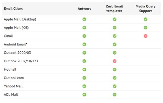
Antwort is a free responsive email template that uses tables to provide responsive layout. With <table>s Antwort works with all email clients.


